


This is not a genocide
It's income generation

They claimed millions died from ‘covid’, let’s not be as guilty as them and invent 17 millions dying from the vaccine, when it’s not supported by any evidence at all.
*Recently Dec 2024 Rancourt has published a retraction of sorts. Saying that of course the vaccine cannot have caused all of the 17 million deaths (his own ‘iconic’ number- what a prat) as this is not supported by the death rate for the jabs- other factors must be involved. Well d’ah Denis!
The vaccines are definitely killing some people. However, excess mortality is not the same as the death rate. Excess mortality is percentage increase in the number of people who died in a given period compared to the average of the previous 5 years for that period, and therefore depends whether the previous years were high or low deaths. A large percentage increase can also represent a small amount of actual deaths. For example a 100% increase might represent 200 deaths in a million compared to 100 deaths in a million people.
A ‘preprint’, non-peer reviewed (and never likely to be) paper from Denis Rancourt Probable causal association between Australia's new regime of high all-cause mortality and its COVID-19 vaccine rollout. The excess mortality in the vaccination period (mid-April 2021 through August 2022) was apparently 14% larger all-cause mortality than in recent pre-vaccination periods of same time duration.
A crude estimate of deaths per week, or 72 week period can indicate that something is happening; as in this graph from the paper. Please also note the lower deaths in 2018 and 2019.

However, we need to take into account both the relative size of the population and any changes to it. An attempt was made to take the population size into account with this graph also from the paper which shows deaths per million, since 1980, in light blue. NB the dark blue line pointing skyward is crude deaths per 16 month period. Please also note the lower deaths in 2018 and 2019.

And again all cause mortality also needs to be adjusted for the increasing age of the population, as the older the population is, the more likely people in it are to die. The graph above from the paper is not age adjusted. Populations of countries, counties or states that have a low and/or declining birth rates will contain an increasing proportion of elderly people. Thus whatever the health measures, good, bad or indifferent; the death rate will keep going up and up. See here for how to do this: Standardised rates of disease.
After age adjusting the ACM in Oz actually looks more like this.

The age standardised all cause mortality for Australians has significantly decreased, at least for Non-Indigenous ones. ‘Over the decade from 2010 to 2019, the age-standardised all-cause mortality rate did not change significantly for Indigenous Australians but decreased by 8.6% among non-Indigenous Australians. This resulted in a widening of the gap by 18% over this period.’
In 2019 there were 393 per100,000 more deaths for indigenous people compared to non-indigenous people living in the same country. I feel that deserves a pause.

Going back to Rancourt’s theory. The overall population in Oz in 2021 was 25,422,788 and there were 171,469 deaths; a rate of 0.674%.The population in 2022 was 26,124,814 (up to 30th September) (a 2.76% increase may be due to flight restrictions meaning that many had been unable to leave) and there were 174,717 deaths up to 30th November and registered by January 2023; a death rate 0.668%.
It seems that the death rate has actually fallen from 2021 to 2022 by an absolute amount of 0.006% (or fallen by a relative amount of 0.89%) .
BP shill Toby Young’s Daily Skeptic reports that ‘Former Actuaries Insitute (sic) spokesperson Karen Cutter told news.com.au that “mortality doesn’t normally vary by more than 1 to 2%”, so the excess mortality seen by Australia during the pandemic years is “way higher than normal levels”.”
This is false. The death rate does hover between 0.6% and 1.2% but the ‘excess death’, eg 11.7% (not the same as the death rate), seen in the data below, can vary a great deal. As we have seen: in the same year there was 18% more death in indigenous Australians than non-indigenous, even after adjusting for population size and age! In England and Wales there was also a drop of 6% (unadjusted for population or age) from 2008 to 2009
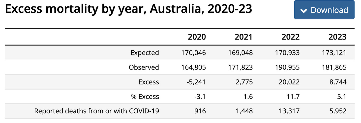
There is no ‘expected’ number of deaths: excess death is the previous 5 year average of crude number of deaths, sometimes excluding high ‘covid’ measures and treatment years of 2020 or 2021. The previous 5 years are all really low death years in Australia, the UK and the US. The ‘excess’ death percentage merely gives an indication that something may be going on. When population and age adjusted, as we have seen, the signal may disappear.
When population adjusted there was actually a small drop in deaths (0.006%) in Australia from 2021 to 2022. Therefore relative to the years 1907-2020 the number of deaths in 2022 in Oz is still very low.
Placing 2021 on the graph below, for men and women combined, would be 674 deaths per 100,000. Placing 2022 on the graph would be about 668 deaths per 100,000 unadjusted for age, so possibly lower.
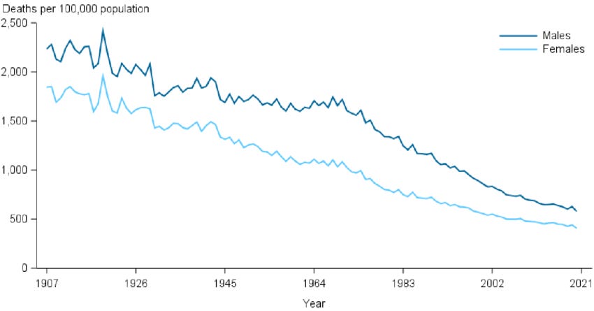
Source: Australian Institute of Health and Welfare (2022). "Figure 5.1: Age standardised death rates in Australia, by sex, 1907-2020".
Here is the are the age standardised rates of death per 100,000 for the UK from 1983 to 2013.

Here is the increase of 0.128% in the (midazolam and ‘end of life care’ deliberate dehydration induced) murder rate in England and Wales between 2019 and 2020.
In England and Wales 2021 saw a 0.04% decrease in death rate, 2022 saw a further 0.02% decrease in deaths from 2021 and there was a further 0.01% decrease from 2022 to 2023.
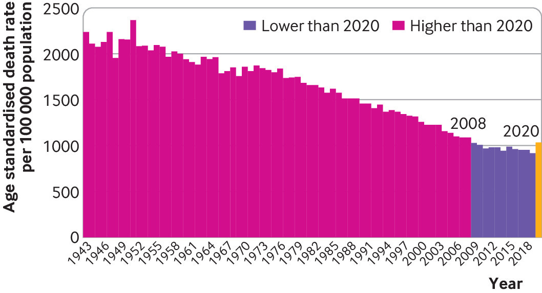
The States looks like this
Here is another case in point regarding excess mortality from Joel Smalley about Japan.
This all cause mortality graph is neither population nor age adjusted. The birth rate and population of Japan appears to be declining, the proportion of those who are elderly and therefore more likely to die, is getting higher and higher. All cause mortality will go on rising whatever the health policies unless the graph is adjusted for age.
The age adjusted death rates in Japan are actually falling Why has Japan become the world’s most long-lived country: insights from a food and nutrition perspective)

This is further born out by the increases in life expectancy between counties with Japan doing very well

Life expectancy was reduced very slightly, by a few months, in 2021 Life Expectancy in Japan Falls for the First Time in a Decade

The life expectancy is still 87.57 for women and 81.47 years old for men. That’s amazing! Updated 2023; in 2022 the life expectancy in women in Japan fell again (the first time since 2010 to 2011) by six months to 87.09 years old, and that of men fell by 3 months to 81.05 years. Still pretty healthy.

It cannot be expected that the death rate will continue to decline nor the life expectancy continue to increase indefinitely.
Moving on to the 17 million deaths from the jabs as Denis Rancourt claims? I struggle with the 17 million figure and sanity. I make it 10 million* ‘extra’ deaths globally compared to the really low death year, but no matter.
We are asked to believe that ALL of these so called ‘extra’ 10 or 17 million global deaths (out of 183 million total) over three years in an ageing population, compared to one unprecedentedly low death year of 2019 (or 2020), were caused by the jabs and not also by ageing, the ongoing effects of lockdowns, loneliness, aggressive end of life care, the doubling in consumption of take aways and junk food, the lack of exercise from closing sport and gym facilities, loss of employment, stress or the flu jabs? This is nuts. And unscientific nonsense.
What appears to be significant increases in the percentage of excess deaths do not represent distinct increases in deaths over a ‘normal range’, they are relative and must be population and age adjusted or they will appear to increase whatever the health policies.
Norman Fenton warned about seeing significant increases in excess deaths when they were not really so when applied to ‘covid’ but seems to have forgotten it when applied to the jabs. When looking at the significance of the crude number of deaths, the size of the increase compared to size of the variation that’s gone before as well as the size of the population must also be considered.
One cannot ascribe any ‘extra’ deaths, let alone all of them, to one factor or variable among thousands in the lives of humans. It is ridiculous. And the deaths are not ‘extra’ they are just a number relative to what has gone before and will always increase in an ageing population. From what I have seen there’s also no evidence of ‘turbo cancers’.
Confusion about excess deaths is another example of how ‘health freedom’ is being manipulated.
I’m not even going to say that the relative rise in ‘excess’ deaths compared to really a low death year is weak circumstantial evidence for death by jab. I’m not saying this because the population adjusted death rate actually fell in the year the jabs were introduced (both in E and W which had a bad 2020 and in Oz which did not). Population adjusted deaths fell again in subsequent years. There is no evidence from the death rate, which fell, for any death caused by the jab, let alone 17 million of them.
I’m not making out that the jabs are less harmful than they are, just appealing to science. I maintain that the vaccines, health policy and drugs are designed to make us sick and permanently on more drugs; not to kill us all. For income generation; not genocide. There is a net increase of 58.5 million more people in the world in 2024 up to November 1st, making 8.18 billion, so the evil Malthusians aren’t doing such a great job of it.
🐒
*17 million 'excess deaths' due to a new factor indicates the death rate would have to have risen over and above the 'normal' number of deaths by 0.07% each year, or 0.21% overall from 2021 to 2023.
It has clearly not done that. Rancourt extrapolates from various data. Looking at England and Wales the death rate was 0.892% in 2019, 1.02% in 2020, 0.98% in 2021, 0.96% in 2022 and 0.95% in 2023 . This represents an increase of 0.19% overall over the very low death year of 2019, so 90% of the number of deaths required (and not age adjusted so in reality even less). When E & W extrapolated to the world this makes 15.3 million ‘extra’ deaths globally.
Globally 5.5 billion were jabbed (out of 8 billion) leaving us with only 10 million (out of the 15.3 million global ‘extra’ deaths) possible from jabs.
The all-cause mortality angle has tripped me up a few times already. I wonder if what I had looked at prior took into account the growing and aging population or if that obscured the issue at hand. On my own journey to realizing vaccines could be more dangerous than the virus (let's table the debate on the existence of virus' for a second) had me run into a standoff between Kirsch and Crawford vs. a Medium Series that goes by the pretentious name as 'the gift of fire'. The Gift of Fire people said there wasn't enough room in all cause mortality for Kirsch's estimates of vaccine death. And they through a 100 graphs at the reader then ended by comparing all those critical with the pandemic to QAnon conspiracy theorists. I'd love to hear what you would make of their analysis and graphs that didn't make sense to me. https://medium.com/microbial-instincts/debunking-steve-kirschs-latest-claims-97e1c40f5d74
Thanks for reminding us of the complexity of calculating excess deaths!